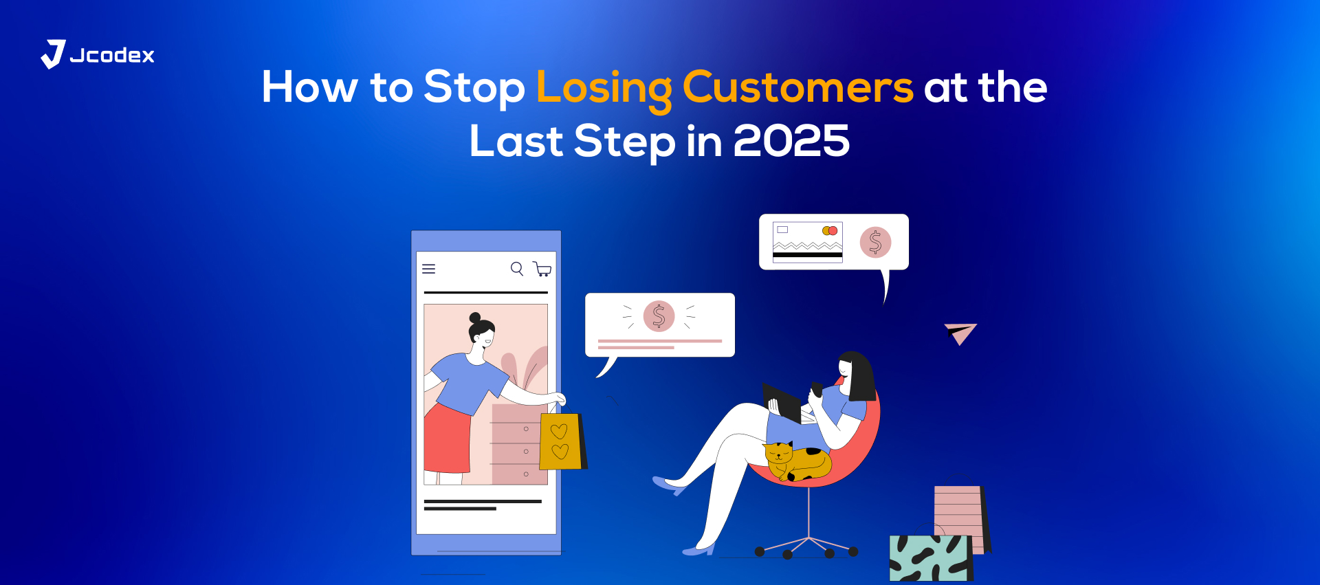
The Problem Nobody Talks About.
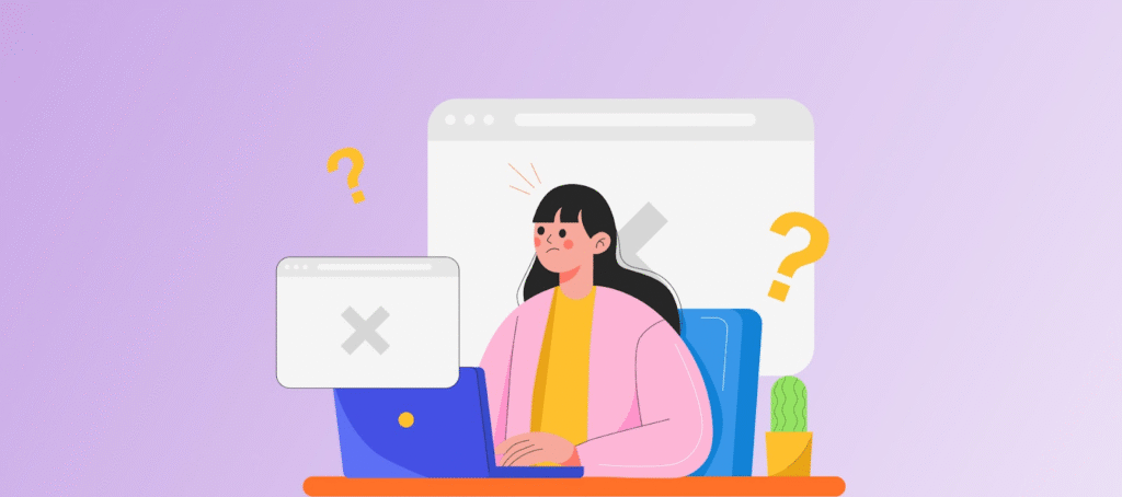
Someone lands on your WooCommerce store. They like what they see, they hit “Add to Cart,” maybe even two or three times. You’re smiling because this looks like a done deal. Then they head to checkout and vanish.
No order. No sale. Just another abandoned cart sitting in your dashboard.
It’s brutal, but it’s also common. According to Baymard Institute, about 70% of online carts are abandoned. And no, it’s not always because customers changed their minds. More often than not, it’s because the checkout experience itself was too long, too clunky, or too frustrating.
Here’s the truth: your checkout page is either your best closer or your worst enemy. The good news? You can fix it.Once you do this the results are quick. You will see more completed purchases without spending extra on traffic.
WooCommerce checkout optimization means making the checkout process easier. This helps prevent customers from leaving right before they complete their purchase.
Why Should You Care About Checkout Optimization?
Think about it. You already spent money (and time) bringing visitors to your store SEO, ads, email campaigns, you name it. Why let them slip away right when they’re ready to pay?
A well optimized checkout page does a few magical things:
- It cuts down friction so buying feels effortless.
- It reassures customers their money is safe.
- It keeps mobile shoppers happy (since most traffic is now mobile).
- And yes it directly increases your conversions.
In other words, optimizing your WooCommerce checkout is one of those rare fixes that costs little but pays off big.
The Usual Suspects: What Goes Wrong at Checkout
Before we jump into the solutions, let’s call out the biggest checkout killers:
- Overloaded forms. Customers don’t want to hand over their life story.
- Forced account creation. Making someone sign up before paying is like asking for their ID at the door.
- Hidden fees. Nothing kills trust faster than surprise charges at the last second.
- Slow load times. Every extra second on mobile is a conversion killer.
- Limited payment options. If you don’t offer their preferred method, they’ll leave.
If any of these sound familiar, don’t panic. You’re about to see how to fix them.
Step 1: Trim the Checkout Form
Here’s the deal: people hate forms. The longer the checkout, the more likely they’ll give up.
So keep it lean. Do you really need to know their company name? Their fax number? (Let’s be real, does anyone even own a fax anymore?) Probably not.
Stick to the basics:
- Name
- Email
- Shipping address
- Payment info
That’s it.
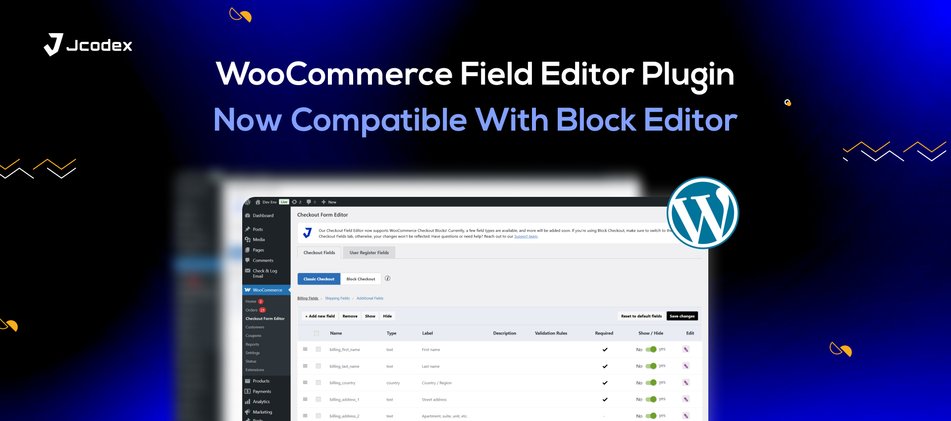
💡 Want an easy tool for this? The Checkout Field Editor for WooCommerce plugin lets you remove, rearrange, or add fields without coding. Your customers will thank you.
Step 2: Let People Check Out as Guests
Imagine you’re buying a single mug online, and suddenly the site demands you create an account. Username, password, confirm password… nope. You’d leave, right?
That’s what shoppers do every day. They don’t want to “join” your store just to buy one product.
Solution: enable guest checkout. It makes the process faster, less annoying, and friendlier. Later, you can offer to create an account with one click after they’ve already purchased.
Step 3: Try a One-Page Checkout
Ever started checkout and realized you still had three screens to click through? It feels endless.
That’s why many stores are switching to one-page checkout. Instead of multiple steps, everything billing, shipping, and payment appears on one page. Simple, clean, fast.
WooCommerce even has an official extension for this: WooCommerce One Page Checkout.
Step 4: Offer Plenty of Payment Options
Here’s something people don’t always consider: the more ways you let people pay, the more sales you’ll close.
Not everyone wants to use a credit card. Some prefer PayPal, others Apple Pay, Google Pay, or local options. If they don’t see their method, they’ll bail.
👉 One option worth looking into is WooCommerce Payments. It’s flexible, secure, and integrates nicely with the platform.
Step 5: Make Checkout Mobile-Friendly
More than half of online shopping now happens on phones. If your checkout form doesn’t look good on a small screen, you’re losing money period.
Here’s what helps:
- Big, easy-to-tap buttons.
- Autofill for addresses.
- Support for mobile wallets like Google Pay or Apple Pay.
Picture yourself on your phone at midnight, half-asleep, trying to buy shoes. If the form is messy, you’ll quit. But if checkout takes 30 seconds, you’ll go through without thinking twice.
Step 6: Skip the Cart Page (Yes, Really)
This one’s controversial, but hear me out: sometimes the cart page is unnecessary.
Instead of sending customers to their cart first, why not send them straight to checkout? It cuts one whole step and makes buying faster.
We’ve covered this strategy before check out Bump Up Conversions in WooCommerce by Skipping Cart Page for a deeper dive.
Step 7: Show Trust Signals
At checkout, people are about to hand over sensitive details. If they feel even a little doubt, they’ll back out.
So give them reasons to trust you:
- SSL certificates (always use HTTPS).
- Security badges (McAfee, Norton, PayPal Verified).
- Refund and return policies written in plain language.
- Customer reviews right on the page.
These things seem small, but together, they make buyers feel safer clicking “Place Order.”
Step 8: Be Honest About Pricing
Few things annoy shoppers more than hidden fees. If they expect to pay $50 and the checkout says $65 (thanks to shipping or taxes), guess what they’re gone.
Be upfront. Show the total cost, shipping included, before they even hit checkout. A progress bar or a clear order summary also helps customers feel in control.
Step 9: Use Plugins to Improve Checkout
WooCommerce is flexible, and plugins make it even more powerful. A few that can save you headaches:
- WooCommerce Checkout Field Editor – Customize checkout fields.
- Direct Checkout for WooCommerce – Skip the cart page.
- WooCommerce One Page Checkout – Combine everything on one page.
- Stripe & PayPal for WooCommerce – Add trusted gateways.
The best part? You don’t need to touch a single line of code.
Step 10: Keep Testing (A/B Style)
Here’s the thing: what works for one store might not work for another. That’s why you need to test.
Try changing one thing at a time:
- Button text (“Buy Now” vs. “Complete Order”).
- Trust badge placement.
- Guest checkout vs. mandatory signup.
Track what performs better and keep the winners. That’s how you keep improving over time.
Wrapping It Up
Your WooCommerce checkout page is the final gate between browsing and buying. If it’s too long, confusing, or untrustworthy, people will abandon their carts. But if you optimize it, you’ll see immediate results more sales, fewer abandoned carts, and happier customers.
Let’s recap the essentials:
- Shorten your forms.
- Allow guest checkout.
- Offer multiple payment options.
- Optimize for mobile.
- Use plugins to make life easier.
- Keep testing and improving.
At the end of the day, checkout optimization is not just about design changes. It is about valuing your customer’s time. The goal is to make the buying process as easy as possible. Do that, and your conversions will take care of themselves.