Facilitating and prioritizing your customers above all else should be your number one goal as a store owner, be it in-person or on WooCommerce. For instance, as handheld devices emerge as the online shopping hub of everyone’s choice, there is a need for stores to adapt to this change.
Of course, it’s not really a new trend, as online shoppers have relied on mobile phones as soon as the first one is successfully connected to the internet. Still, let’s try to understand why meaningful mobile optimization is so important, and what it includes.
What Is “Mobile-First Design” And Why Does It Matter?
“Mobile-first” Design is an inclusive, ground-up trend in web building that takes the needs of all internet users into account, starting with the high-priority ones. Specifically, a website that is built on a mobile-first foundation must consider the needs of smaller screens and devices, i.e. mobile phones, and work its way upwards.
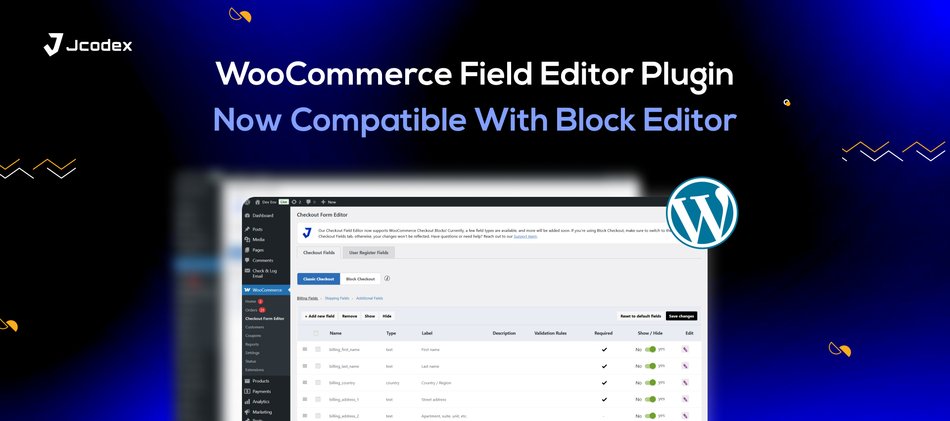
For instance, let’s say you’re using a WooCommerce checkout field editor to customize and enhance your checkout page. A mobile-first approach will enable you to build checkout forms that work perfectly on mobile phones and PCs alike. This will prove useful for online shoppers and help you build a more convenient and scalable interface.
The Mobile Commerce Explosion
M-commerce, or mobile commerce, started as an offshoot of commercial web browsing and has since dominated the scene. Today, the vast majority of online shoppers rely on their tablets and smartphones to order goods, make bookings, and connect with service providers.
Key Principles Of Mobile-First Design
There are some crucial aesthetic and functional aspects that distinguish mobile-friendly websites from the rest. These partly include the key features of mobile phones and similar devices, which include:
- Smaller Screens: With less space to work with, WooCommerce or WordPress stores need to adjust their landing pages and key assets, like images and checkout fields, to smaller screens. Without mobile-first design, the pages might end up being glitchy, inconsistent, and unresponsive.
- Less Power: Mobile phones have less power than computers, which means they can’t run heavy-duty applications or graphics-rich websites. To address this limitation, designers should use lightweight fonts and images that aren’t too large in file size. This way, mobile users can still access the site without experiencing any loading issues or crashing their device.
- Touch-Powered Interfaces: Interfaces that use tactile operating systems must respond swiftly and accurately to all manner of tapping, swiping, and pinching to help buyers navigate. So, rather than using long scrolling pages or dropdown menus, there’s a need to break content into smaller, more digestible chunks.
Besides the distinct or limited capabilities of phones, however, you must also contend with the unique behaviours of phone users, which may include:
- Hasty Purchases: Buyers that have the patience to physically open and power on a laptop to order shoes or book movie tickets tend to be in a hurry. So, you need to optimize your mobile site for speed and responsiveness.
- Shorter Attention Spans: Online shoppers in general tend to be more easily distracted even before you account for the device they’re using. But if they’re buying on the move or in bed, they likely won’t be paying attention to long pieces of text when shopping. So, minimalism is the name of the game.
Costs Of Poor Mobile Optimization
Poor User Experience
An online store that isn’t built with mobiles or its users in mind will experience more lagging, poor navigation, and layout-related issues. This will lead to more frustration among buyers, which they might express through poor ratings and reviews, and that is if you’re lucky.
Reduced Conversion Rates
If you’re unlucky, however, your buyers might take their business elsewhere. Poor mobile optimization tends to correlate with higher cart abandonment rates and loss of traffic.
Lower Search Engine Rankings
And with the low traffic, your SERP rankings are highly affected. Plus, since the late-2010s, mobile-first design has been an essential SEO criterion for Google’s ranking algorithm. And those who fail to meet it might as well bid their visibility farewell.
Basics Of A Mobile-Friendly WooCommerce Store
With so much at stake, you’ll be glad to know that the essentials of mobile-first design are no rocket science. To illustrate that, let’s go through the essentials of mobile-friendly store design.
- Choose The Right Theme
For WordPress sites, there is no shortage of themes that can adapt well to all manner of screen resolutions. Templates and themes that use a “hamburger” style layout or minimal text are a great choice for your store.
- Optimize Website Speed
Poor site speeds can corrode your conversions and SEO, so you’ll need to improve its performance. As usual, the best solutions include browser caching, optimized images and code, and using only the essential plugins.
- Simplify Navigation
Every aspect of your website, from your hierarchy to the checkout flow, must be streamlined and responsive. Make your menus concise and your content organized, so that users can promptly find what they’re looking for.
- Simplify The Checkout Process
Speaking of checkout, this is a pivotal touchpoint where you’ll need to win over your customers. Use a quality checkout manager for WooCommerce to iron out your checkout page. Optimize your custom fields, guest checkout, and payment gateways for smartphones and tablets.
- Declutter Your Store
The best solution for a smaller and less powerful device is limiting your WooCommerce or WordPress store to the essentials. Keep text to a minimum and choose minimalist and cohesive layouts that don’t overwhelm your server or your buyers.
Conclusion : Woocommerce
For a WooCommerce store, mobile optimization is a top priority and a no-brainer. Luckily, mobile-first design is a fairly straightforward, and perhaps even innovative, approach in online shopping. So, take the steps to ensure that every element of your page, from the checkout flow to the “About Us” section, is fully designed with phone users in mind.


