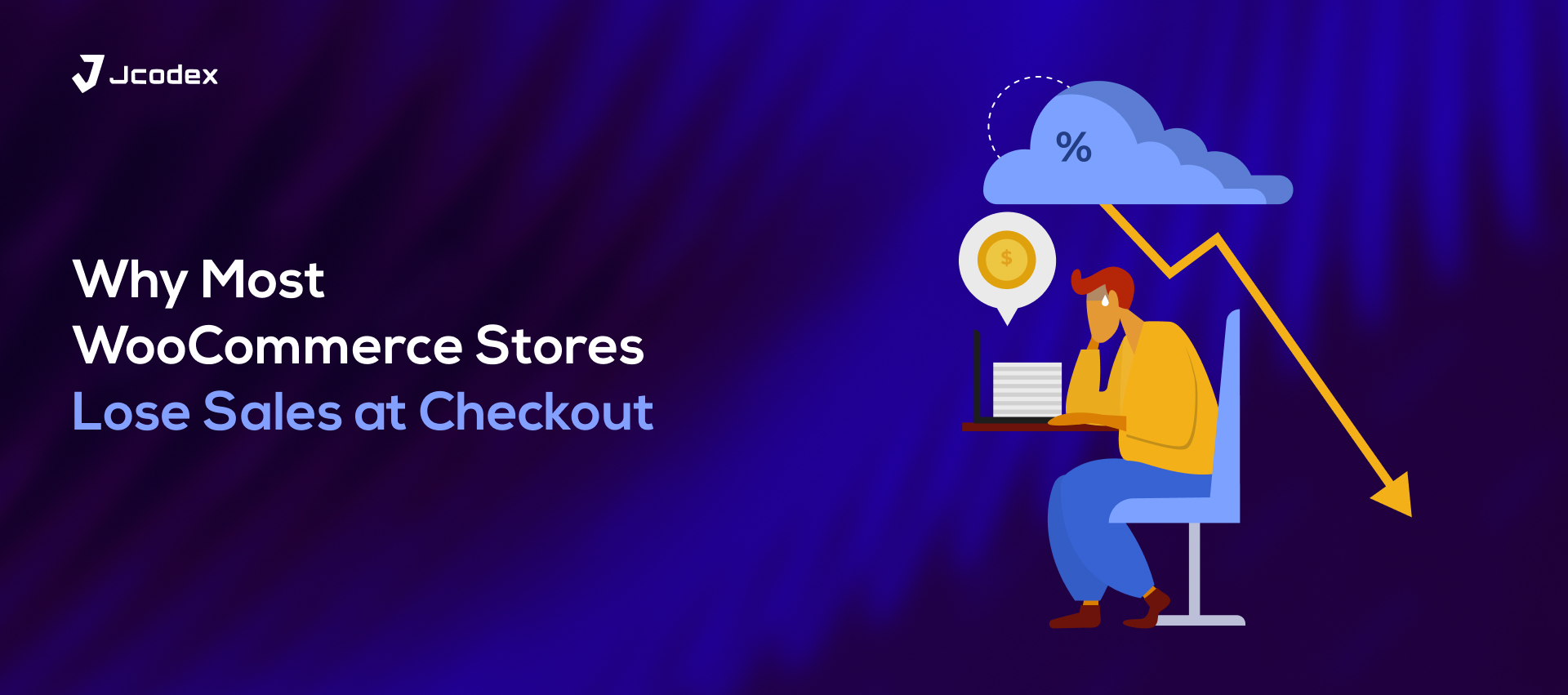
The checkout page is more than just the last step of a sale, it’s the moment of truth. Every button, label, and field either reassures the customer to move forward or adds friction that makes them hesitate. In online stores powered by WooCommerce, even the smallest tweak can transform browsing interest into real conversions.
Why Checkout Psychology Matters
When someone reaches the checkout page, they’ve already decided they want the product. What happens next depends on how easy, safe, and emotionally reassuring that final step feels. Psychology plays a big role here small design choices influence how the brain processes trust, effort, and urgency.
Think of checkout optimization like a conversation. Every element, the form fields, the order summary, the payment options either builds confidence or creates confusion. A single word or visual cue can shift the customer’s decision from “I’ll think about it later” to “Let’s buy it now.”
The Power of Simplicity
One of the most proven psychological triggers in checkout optimization is simplicity. Shoppers crave a frictionless experience. When a checkout form looks complicated or asks for too much information, the brain perceives it as extra work and that’s when hesitation sets in.
In WooCommerce, removing unnecessary fields often results in immediate conversion lifts. Many store owners use tools like a Checkout Field Editor for WooCommerce to remove, rearrange, or customize form fields based on what actually matters. Fewer distractions mean fewer chances for customers to abandon their cart.
For example, imagine a store selling handmade jewelry. During checkout, the form originally asked for a company name, phone number, and secondary address line even though 90% of buyers were individuals purchasing gifts. By removing those fields, the checkout looked cleaner, faster, and more personal. The completion rate rose by almost 12%.
Simplicity doesn’t just mean fewer fields, it means reducing cognitive load. When customers see a form that feels light and intuitive, it creates the feeling of progress, not effort.
Building Trust at the Right Moment

Trust signals during checkout are another psychological cornerstone. When people buy online, they’re making a leap of faith that they can’t see or touch the product. Every element that reinforces safety helps bridge that gap.
Subtle changes like adding a lock icon beside the payment section, displaying accepted payment methods, or showing small trust badges can significantly improve conversions. It’s not about overwhelming the user with logos but about placing reassurance exactly where doubt usually arises.
A study from Baymard Institute found that checkout trust issues are among the top reasons for cart abandonment. Simple cues like “Secure Payment” or “Free Returns” placed near the payment button can ease hesitation and subconsciously push the user to complete the purchase.
Emotional Momentum and Progress Indicators

Human psychology is wired to seek completion. That’s why showing a progress bar or step indicator in WooCommerce checkout works so well. It helps customers feel in control and see how close they are to finishing the process.
For example, a two-step checkout showing “Step 1: Billing Details” and “Step 2: Payment” feels less intimidating than one long, scrolling form. The mind interprets progress as momentum once a person starts filling in the details, they’re more likely to finish because stopping halfway feels incomplete.
Adding emotional momentum through small progress cues is a classic behavioral design principle that pairs perfectly with eCommerce optimization.
The Art of Optional Fields
Psychology also tells us that giving people choices but not too many makes them feel empowered. WooCommerce allows store owners to customize checkout fields to add optional ones like “Order Notes” or “Gift Message.” These fields add personalization and warmth to the experience.
However, too many optional fields can overwhelm the form and backfire. The trick is to include only what adds value to the customer journey. A single, friendly text field like “Leave a note for delivery” can humanize the experience and subtly increase satisfaction.
Many businesses use a WooCommerce Checkout Manager plugin or similar tools to fine-tune this balance adding just enough personalization without breaking simplicity. A customer who feels seen and understood is far more likely to complete the purchase.
Visual Hierarchy and CTA Psychology

Visual hierarchy the way information is arranged guides how the eyes move across the page. When a checkout button stands out clearly in color and placement, it drives attention and action.
The psychology behind Call-To-Action (CTA) buttons is well-documented. Phrases like “Complete Order” or “Place My Order” feel more personal and decisive than “Submit.” Warm, contrasting colors (like orange or green) work well because they naturally evoke confidence and completion.
Spacing and white space also play a role. A cluttered checkout creates tension, while balanced spacing feels calm and trustworthy. Customers might not consciously notice these things, but their behavior reflects it. Clean layouts keep the mind relaxed and relaxed minds convert better.
Anchoring and Reassurance in Pricing
Another subtle psychological trick is anchoring showing relative value to reinforce the purchase decision. Displaying the original price with a small strikethrough beside the discounted price helps customers feel they’re getting a deal. Adding a small line like “You save 20% today” can trigger a positive reinforcement loop.
Equally powerful is reassurance language. Words like “Fast,” “Secure,” and “Guaranteed” calm doubts. Even short sentences under the payment section such as “You can review your order before confirming” make the experience feel safe and controlled.
In WooCommerce, these details can be added through customization plugins or small template tweaks but their psychological impact is far greater than their technical complexity.
Reducing Friction with Autofill and Guest Checkout
Every second saved during checkout matters. Cognitive psychology shows that when people face small annoyances like retyping an address or creating a mandatory account their decision fatigue increases.
That’s why features like guest checkout and autofill fields dramatically reduce abandonment rates. Allowing customers to buy without account creation lowers resistance. For repeat users, saved billing details turn the process into a one-click experience.
Think of it as micro-speed. The faster it feels, the more effortless it seems and effortlessness is one of the most persuasive psychological levers in online shopping.
Storytelling and Personal Connection
Even at checkout, emotion drives action. Adding short, emotionally resonant messages such as “Your order supports small creators” or “We’re packing your item with care”can transform a simple transaction into a story. Humans buy emotionally and justify logically.
This form of micro-storytelling reminds customers that there’s meaning behind the purchase. It subtly validates their decision and adds a human heartbeat to the digital process.
Conclusion: Smart Psychology, Smarter Checkouts

Checkout optimization isn’t about tricking customers, it’s about understanding them. Every detail, from the number of fields to the shape of the button, tells a psychological story. When a checkout feels simple, trustworthy, and emotionally aligned with the buyer’s expectations, conversions rise naturally.
WooCommerce gives store owners the flexibility to shape this experience with just a few smart adjustments. Whether through layout design, trust cues, or custom fields, small improvements rooted in psychology often lead to big sales results.